National Rail
App UX and design for the UK’s official rail transport body, launched on two brand new tech platforms.
Background
Tasked with revamping National Rail’s presence for two very different platforms—Apple Watch (a shiny new thing everyone wanted) and Windows Phone (a device you’ve probably forgotten about)—I was brought in to define the user experience and keep tech-savvy travellers connected.
Process
For Apple Watch, we worked with then-unreleased GUI guidelines to design an interface that made onboarding and daily use a breeze—minimal confusion, maximum usability. On the Windows Phone side, we collaborated with Microsoft to fit National Rail’s app into the platform’s unique framework, making sure the experience stayed seamless for first-gen adopters and Nokia fanboys.
Result
Getting the chance to work on the launch of two iconic intrinsic apps was a huge honour. Being featured in the Apple Watch launch event? Huge win. As for the Windows Phone app… if you didn’t see it, you weren’t alone. Still, the app did its job brilliantly, and I still have an affinity for the clarity and efficiency of its interface. Despite its quiet debut, I stand by the effectiveness of the tool— perhaps sometimes, greatness flies under the radar 😉
Apple Watch app ⌚
-
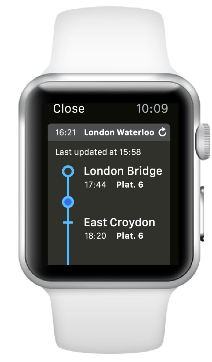
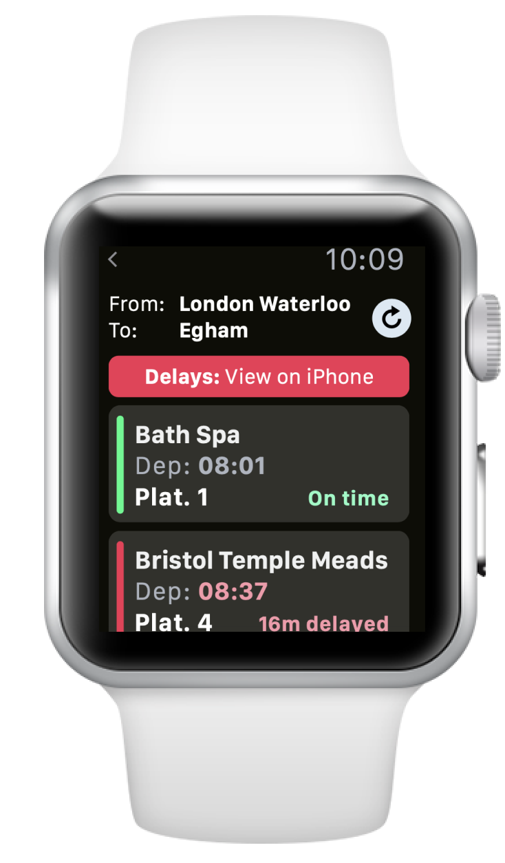
![Train route on smartwatch]()
Journey details
01 NRE Apple Watch
-
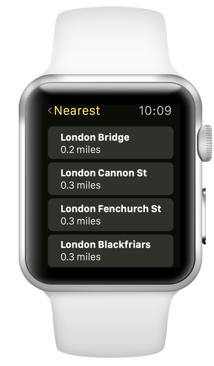
![Nearest stations on smartwatch]()
Nearest stations
02 NRE Apple Watch
-
![Train separtures on smartwatch]()
Departures
03 NRE Apple Watch
Tech on rails
Snapshots of National Rail’s app implementation across platforms


Windows Phone app 🤷
-
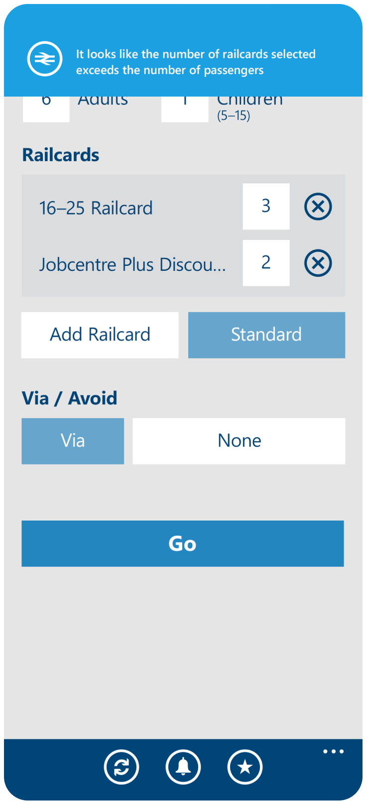
![Phone screen of search form]()
Search form
01 NRE Windows Phone
-
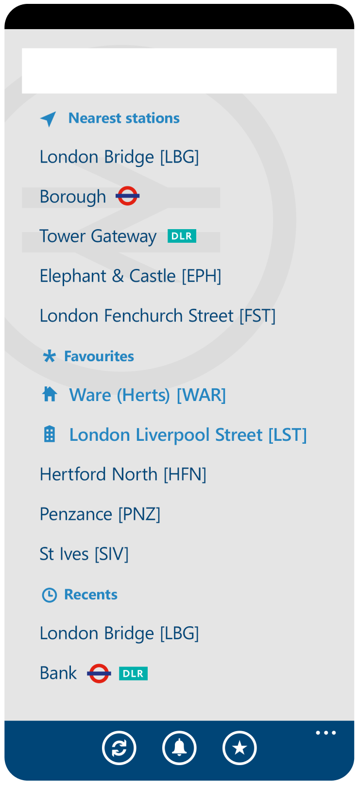
![Phone screen of train station names]()
Station search
02 NRE Windows Phone
-
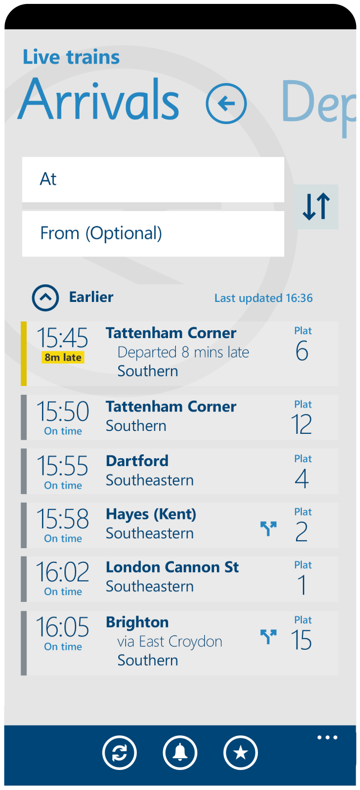
![Phone showing arriving trains]()
Arrivals
03 NRE Windows Phone